When we started this series on color, we had no idea where it would take us. We knew that we wanted to talk about the different colors going around the color wheel and what they mean for each of the seasons in terms of Color Analysis. Doing this has prompted us to do some very deep diving into each of the four seasonal palettes, and to further refine our 16 sub-seasonal palettes as well. Color Analysis is one of the core tools that we use at Flourish to support our clients in having the wardrobe of their dreams that is curated precisely to who they are.
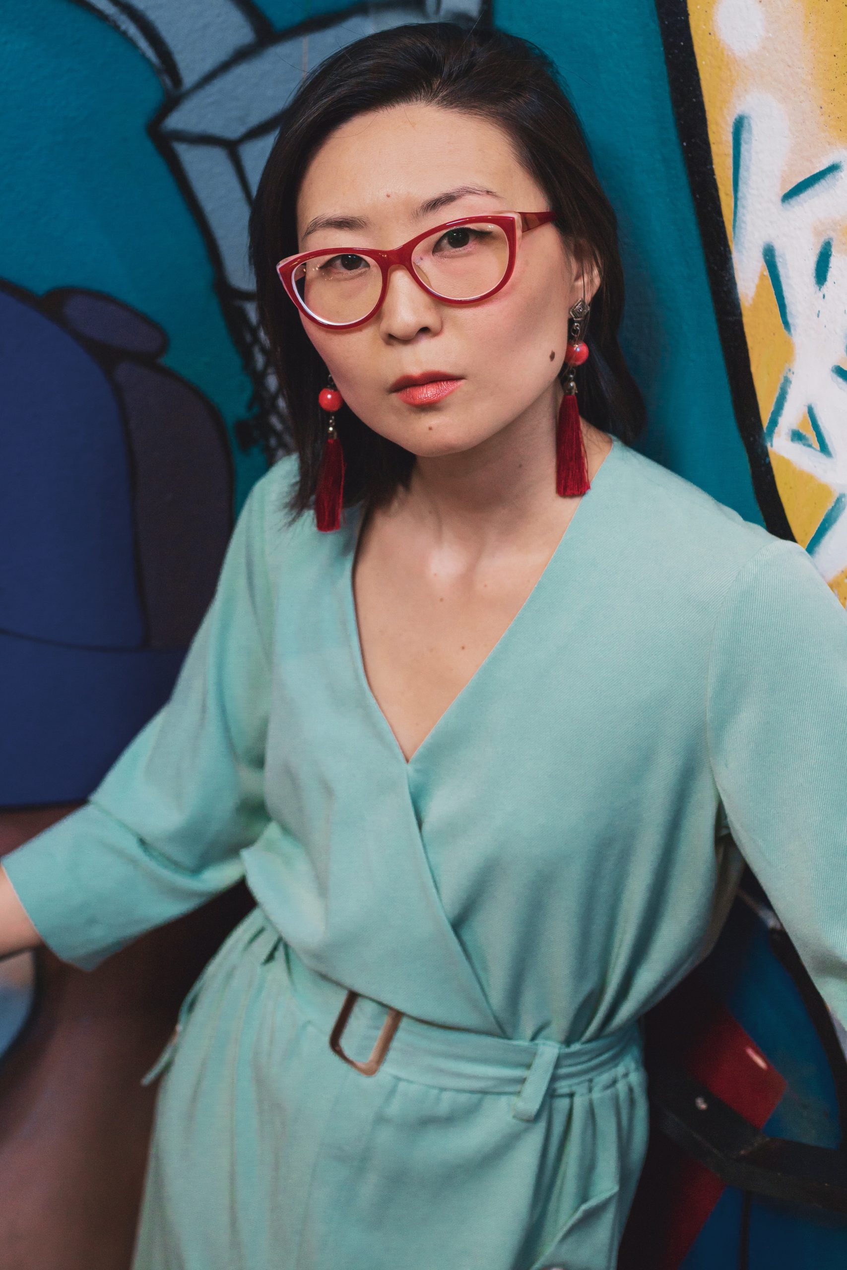
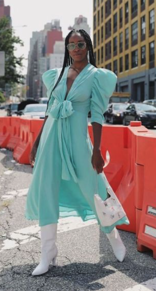
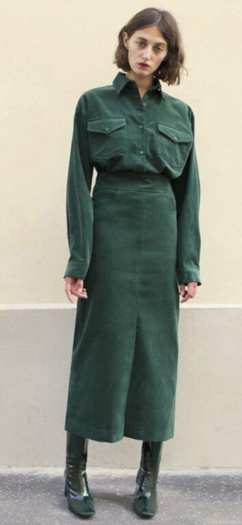
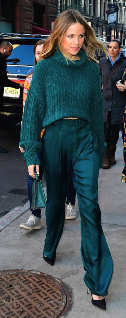
The color we are looking at this time around is kind of different from the others, in that it is not one we would generally identify independently. It is a combination of two of our favorite colors – blue & green. This color combo encompasses a wide variety of colors, from bright aqua to deep teal, turquoise, and jade. For the sake of simplicity in lingo, we will be referring to the colors that fall into this category as teals.
Universal Colors
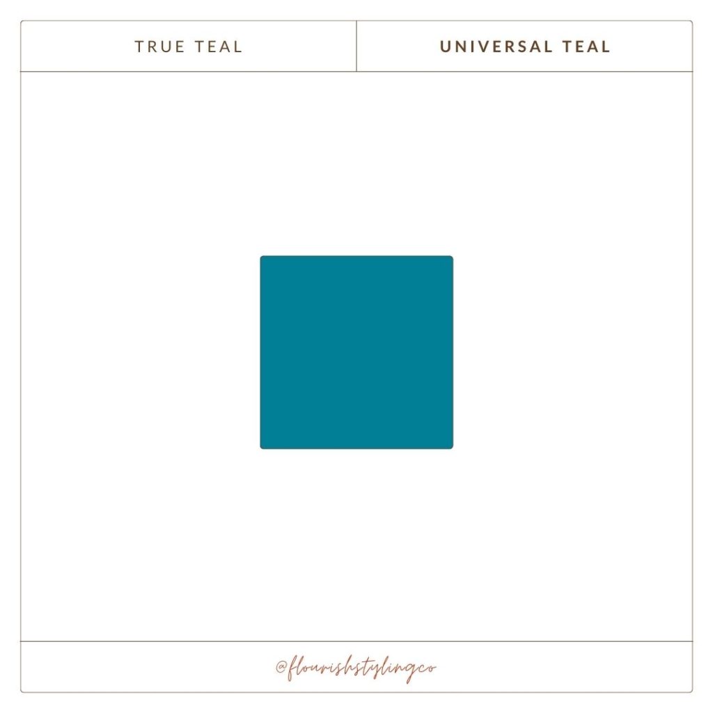
True teal is a universal color, making it a great go-to color if you aren’t sure what works best for you. We briefly talked about universal colors in our blog post on our favorite neutrals for each of the seasons, because navy is a universal color. That means each season can wear navy without any real detriment. There are, of course, different shades within the navy family that are best suited for the nuances of each season. You can go back to our neutrals post for visual examples of this. True teal has a balance between warmth and coolness, and is neither too bright or too muted.
As with all other colors we have talked about, there are colors on the teal spectrum that are best suited for each individual season, with some crossover. Cool teals are more of a blue-green color, with a strong blue undertone that creates a crisp and refreshing look. These shades of teal can be compared to a blue-green ocean, and are best for Winters and Summers.
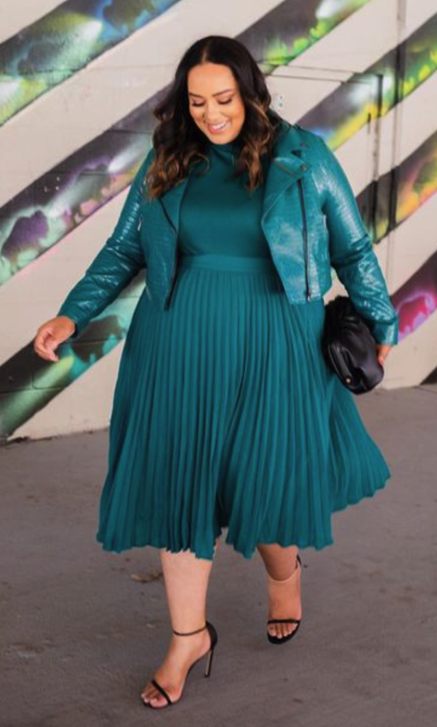
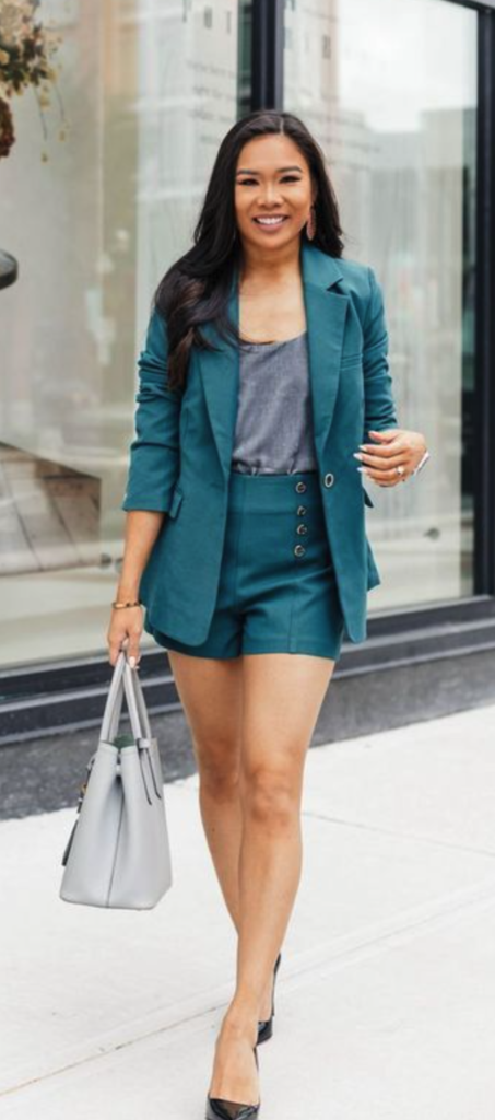
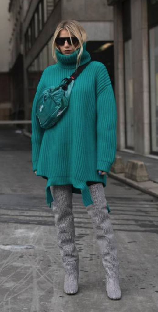
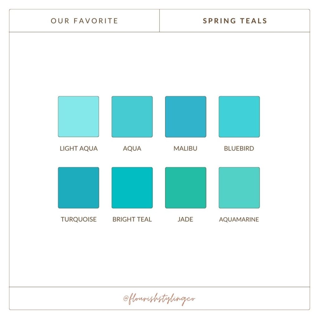
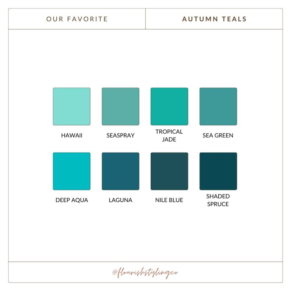
Warm teals, on the other hand, have a green undertone that creates a more muted and earthy look. These shades of teal can be compared to a tropical jungle, and are ideal for Autumns and Springs. Here is a breakdown of our favorite teal/blue-greens for each season! Do note that the palettes below are not meant to be all-encompassing, but rather some of our favorite shades from this color family.
Our Favorite Teals for Springs
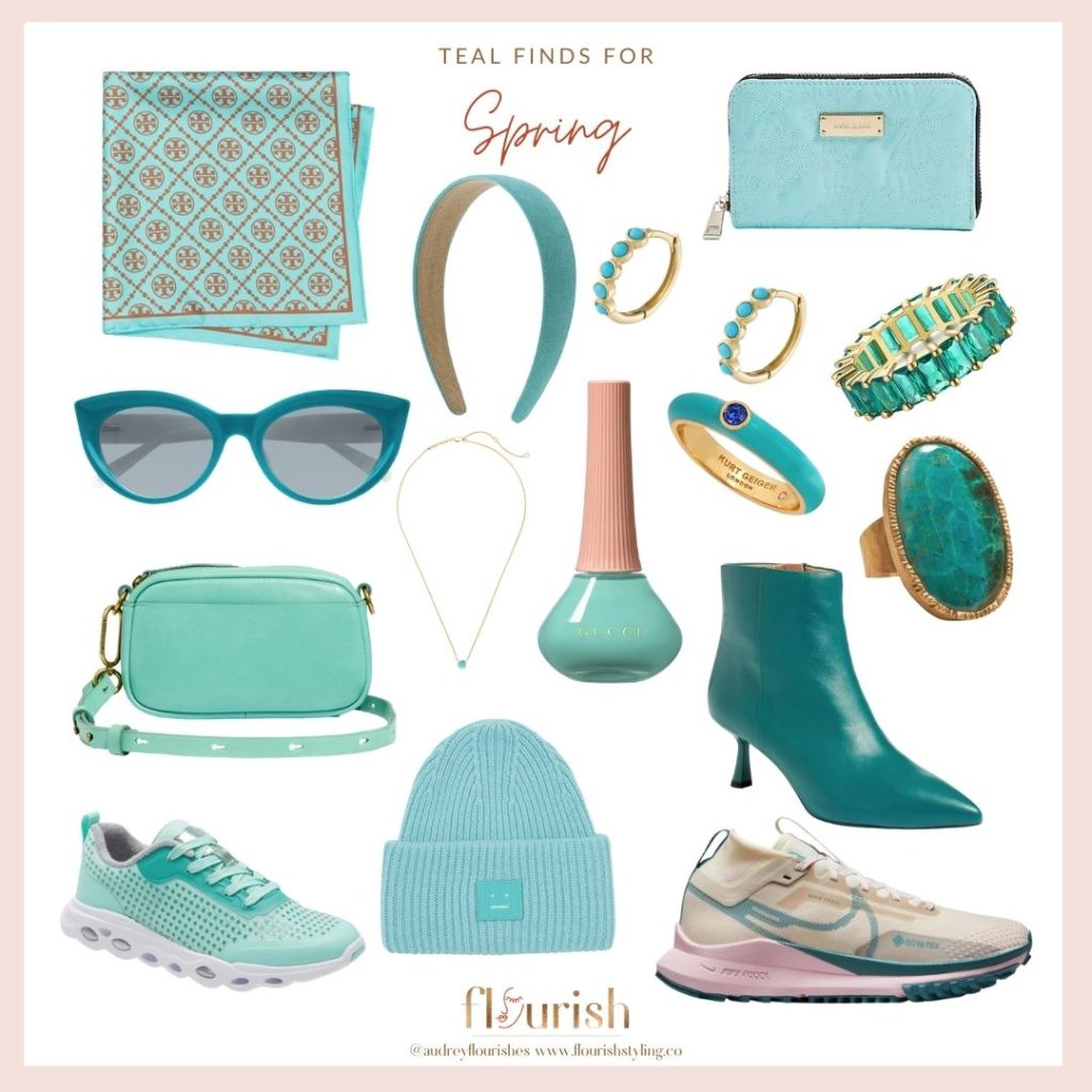
Teals that work best for Springs are bright, splashy, and have beachy vibes. Springs cannot go too dark in their color palette for fear of appearing muted. When you add a warm shade like yellow or orange to the undertones of this color, you get a wide variety of shades that are excellent for this season.
Our Favorite Teals for Summers
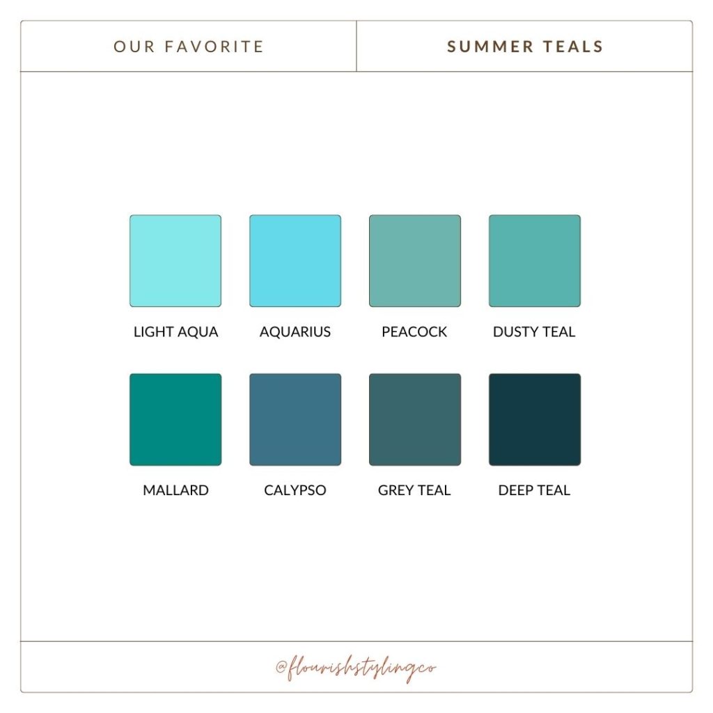
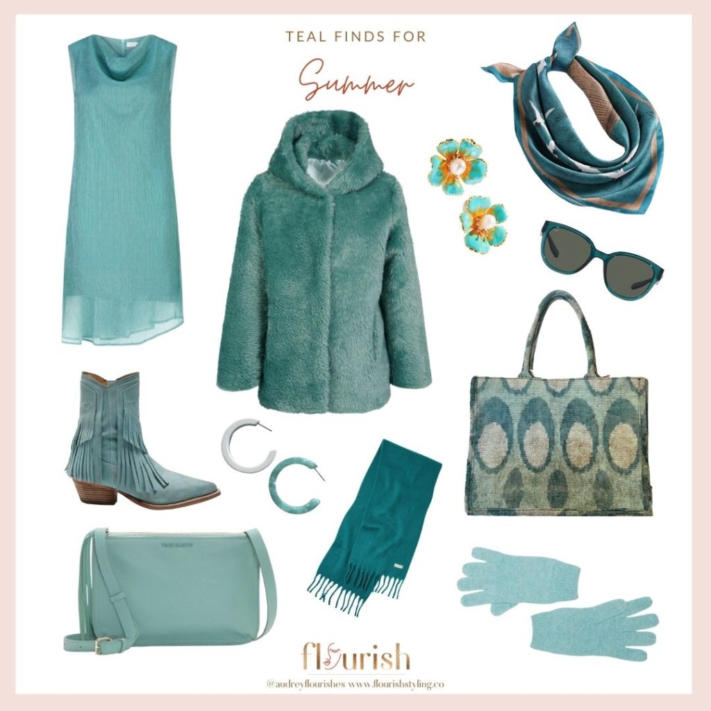
The teals that resonate best with Summers will venture into softer, muted qualities. There is some crossover you’ll see with light aqua also living in the Spring palette, and peacock and dusty teal will also be shared with Autumn. True and Cool Summers share deep teal with the Winter palette, but those who are a Light or Soft Summer might want to steer clear of that shade.
Our Favorite Teals for Autumns
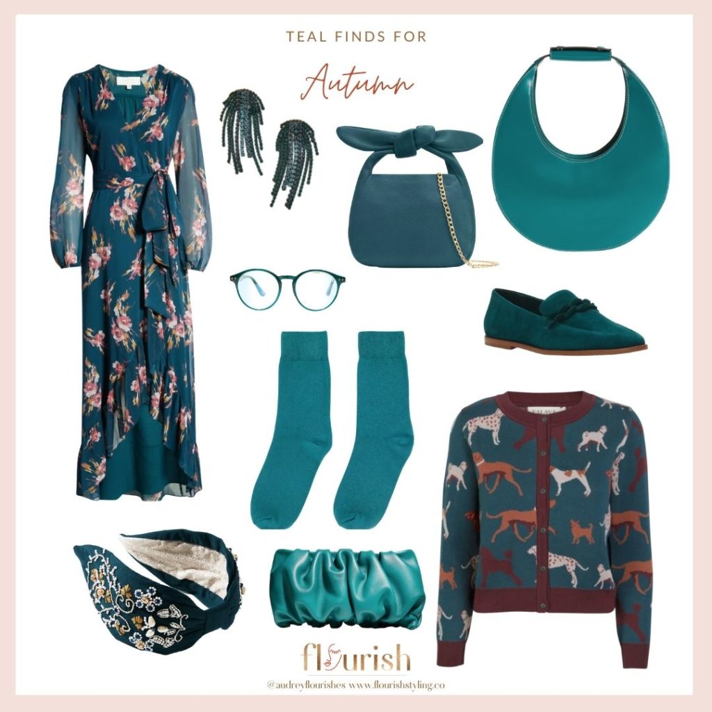
Autumns have a wide variety of teals that work for them because all shades from medium to dark resonate with their palette. These teals evoke thoughts of deep ocean water and warm sunny days. Like the Summer teals, these are muted and softer, but with warm undertones.
Our Favorite Teals for Winters
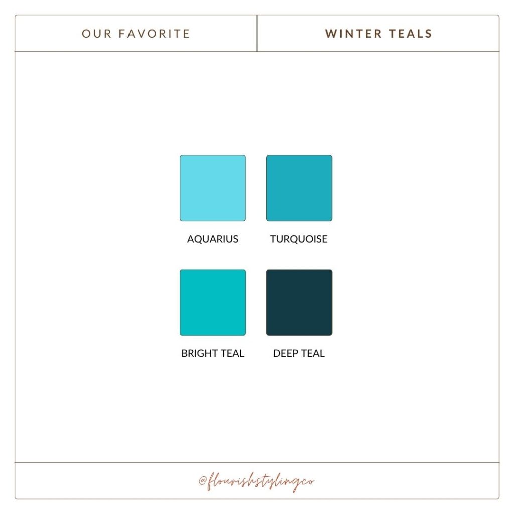
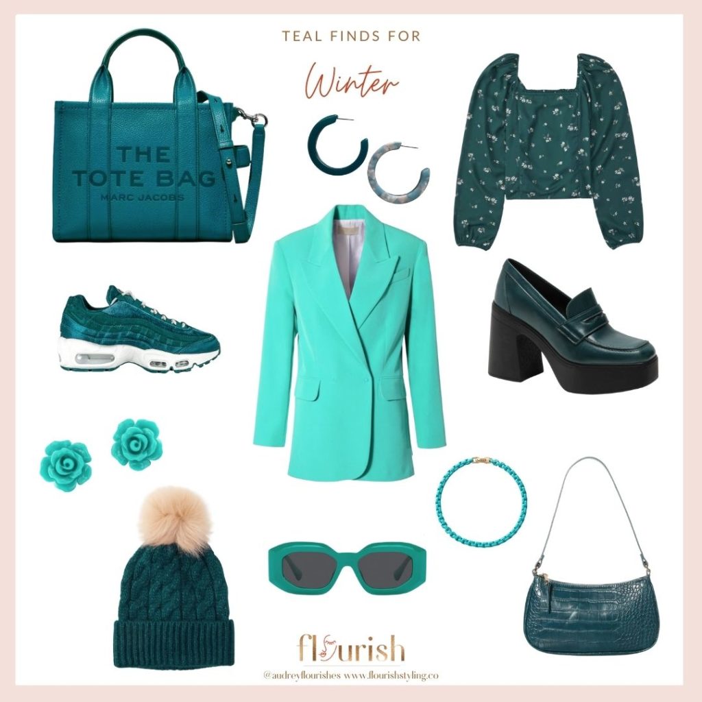
Teals for the Winter palette are not quite as numerous as in the other three seasonal palettes. This is because Winters require a certain amount of brightness and clarity while not going warm, and this is pretty exclusive to colors like the ones you see below.
Understanding each of the four parent seasons
If you’ve been keeping up with each post in this series, you’ll have a pretty good idea by now of the qualities of each season, and how that affects their palettes. If you are new here, welcome! We would encourage you to go back and review our existing color posts so you have a great foundation for our color exploration.
Don’t know your season?
If you don’t know your season & sub-season yet, never fear! There is a really great service we offer called Color Analysis, where we drape you in all sorts of fabulous color drapes to determine what your best colors are. If you’re not located near Pittsburgh, however, we are now offering Virtual Color Analysis, which entails taking a series of photos of your glorious face, and analyzing the tones in your hair, skin, eyes, and lips, to determine the details of your coloring.
While we are super excited to offer this service, it is worth saying that nothing compares to having your colors done in person, but we feel strongly that services like this should be more accessible! If you’re curious to know more about this service, feel free to reach out to us and we would be happy to provide you with all the information.
This post contains affiliate links. If you use these links to buy something, we may earn a commission. Thanks!
