This post contains affiliate links. If you use these links to buy something, we may earn a commission. Thanks!
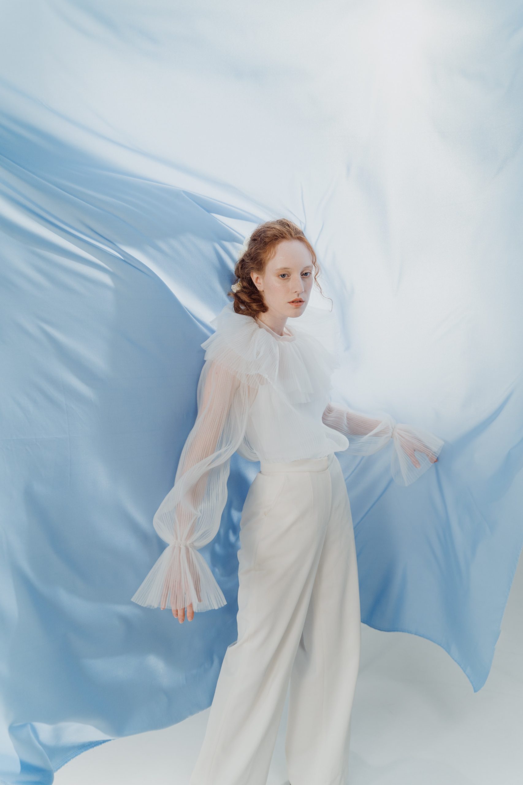
Did you know that blue is one of the most commonly picked favorite colors in the WORLD? And, there are so, so many pop culture references to the color blue. There are songs, movie characters, and works of art that all revolve around this color. And let’s not forget about the iconic blue jean! There are, as you probably know by now, certain blues that are best by season according to Color Analysis. So let’s get true blue, have a blue Christmas, get bluer than blue, and look at that blue moon (if you know all of these songs, well then you’re blue da ba dee…).
Blue in color psychology
In color psychology, the color blue is mostly connected to positive emotions, like relaxation and happiness. It can also denote sadness or melancholy. But on the whole, it connects us to meditative and healing states, even if sadness is part of that journey. We connect to the wide open blue skies and the vast depth of the dark blue seas. But what does this all mean in terms of color analysis?
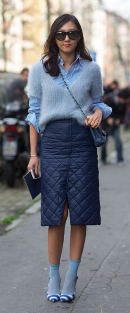
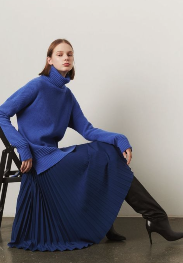
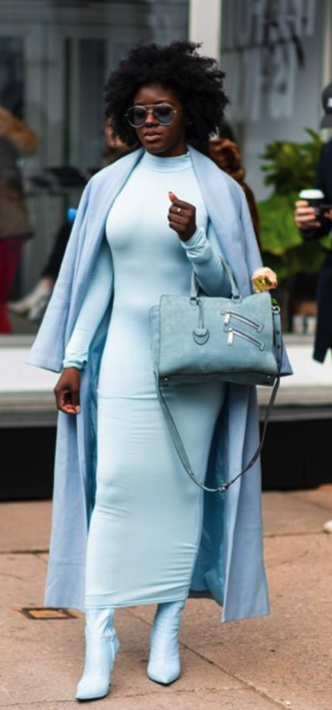
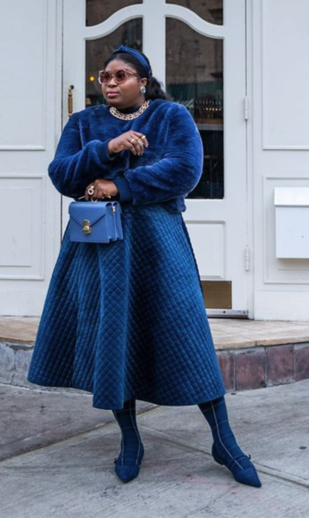
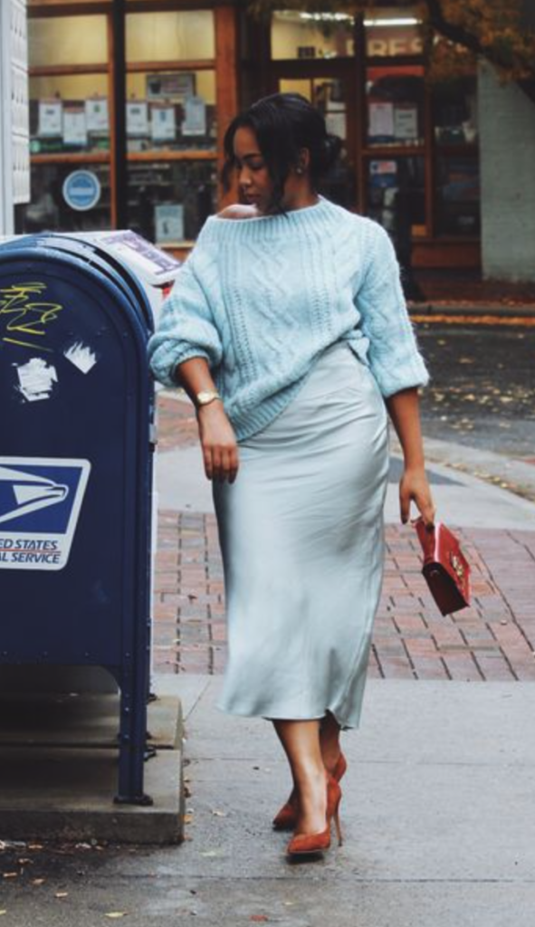
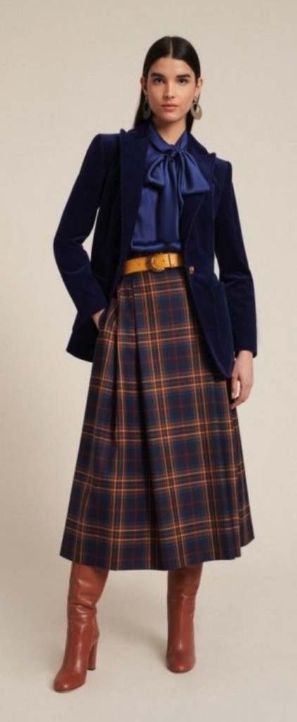
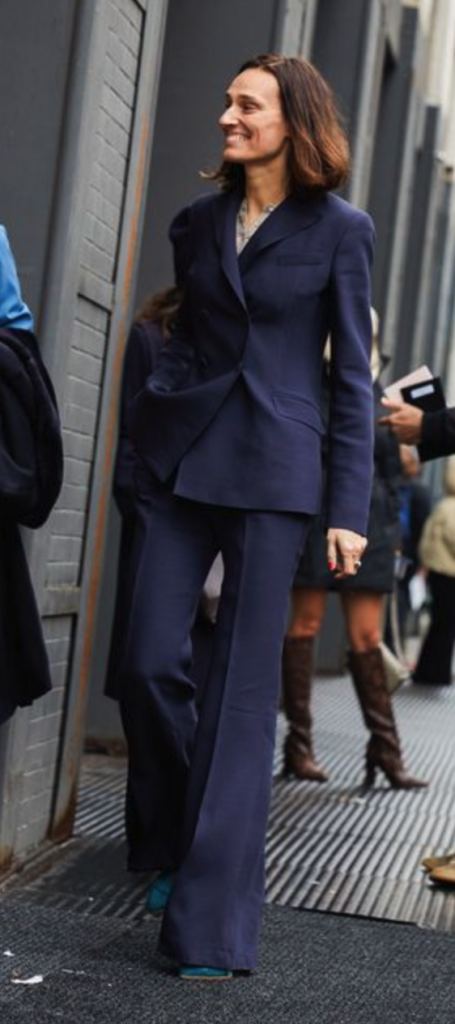
Blue is super cool
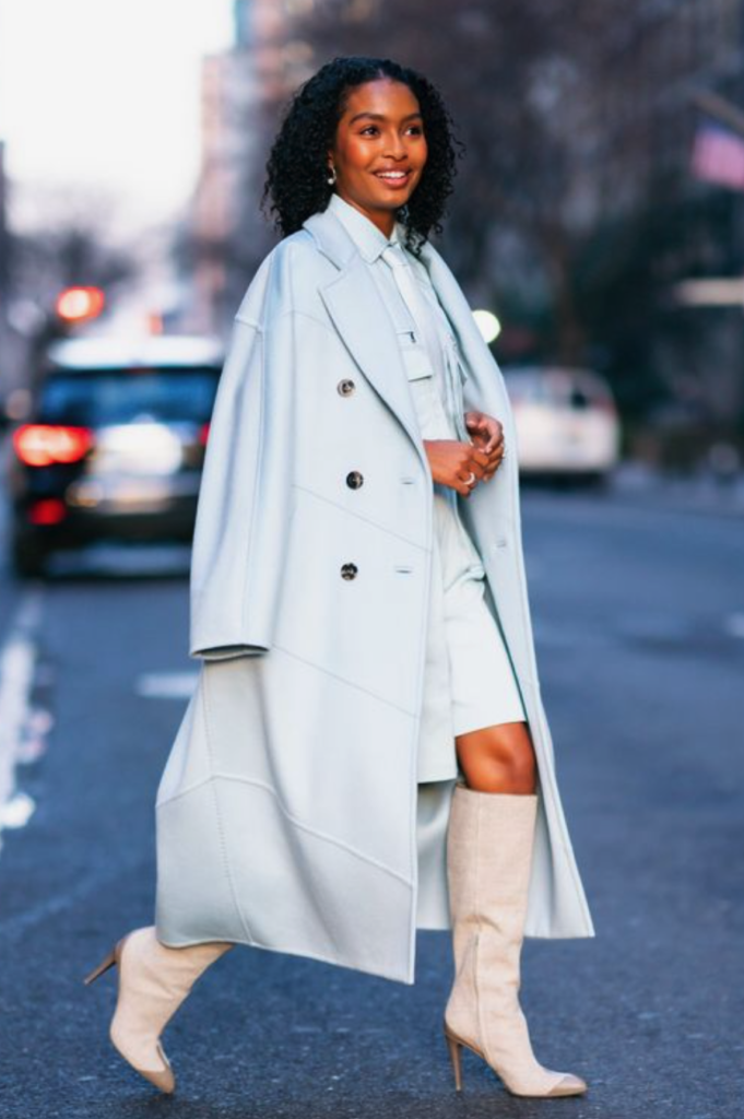
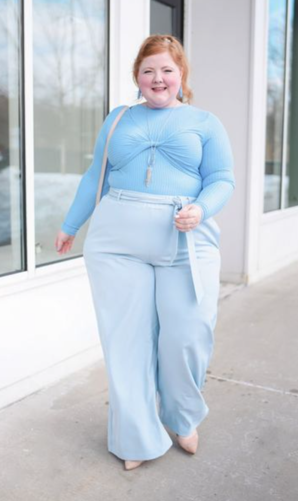
I have great news for you Summer and Winters out there – it is your time to shine! We know you were neglected in our discussion of orange and yellow, and we apologize. But blue is one of the more naturally occurring cool-toned colors we get to discuss within Color Analysis. Those who fall into one of these two seasons tend to have blue to neutral undertones. There are certainly warmer blues that we will see in the Spring and Autumn palettes, but these have varying amounts of yellow and green tones mixed in to warm them up.
Blues can be warmer with a little help for Autumns
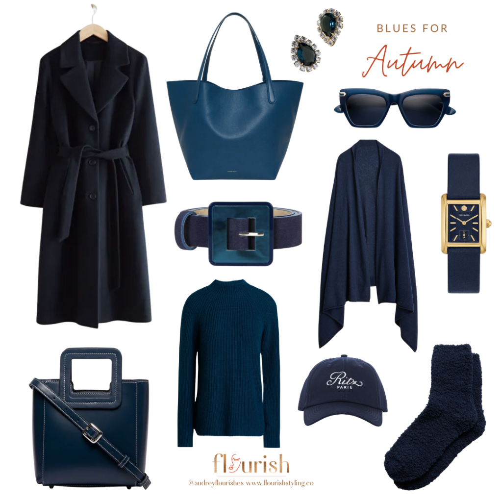
Let’s break down the qualities we see in blues that are included in the Spring and Autumn palettes. We know that they will all have a warmer hue, with varying values and chroma. The blues in the Autumn palette all have a much more distinct warmth to them, as you can see in marine navy, sea blue, and viking blue. Quite telling that all of these blues have names that connect them to the depths of the ocean! In our experience, we find that the darker half of the palette is supremely best for a Deep Autumn, as opposed to the other sub-seasonal palettes. Soft Autumn shines in lighter shades like sea blue, which is shared with Summer.

Light and tropical blues in Spring
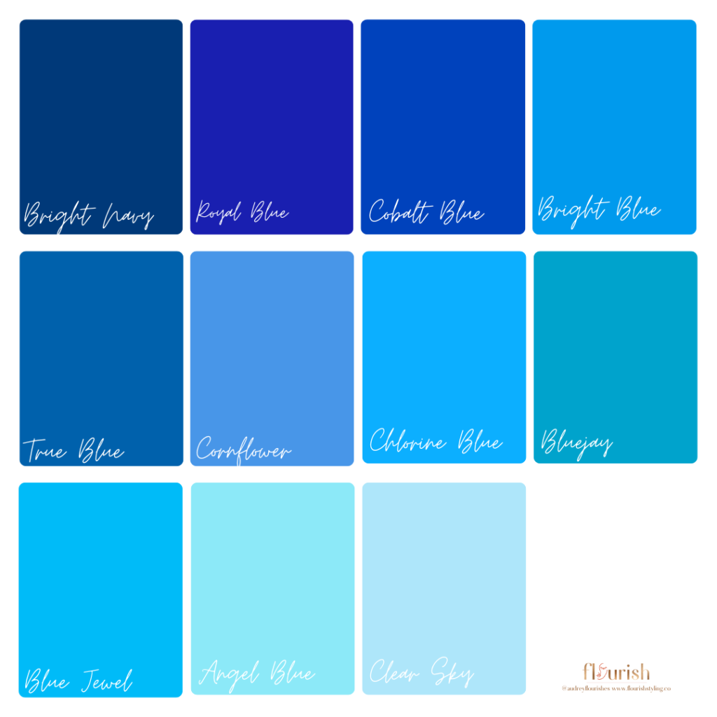
Spring blues are all going to be light and bright, in alignment with the qualities of this season’s palette. Similarly to the Autumn blues, these do have hints of ocean tropical vibes, but instead of reflecting the depths of the sea, these will conjure images of being poolside, with colorful frozen cocktails and umbrellas for two. Looking specifically at each row of colors in the palette, you can see how they range from deep and saturated to light and bright. Bright navy to bright blue are simply perfect for a Bright Spring, while the medium to light shades really resonate with True and Light Springs.

Summer blues are cool and breezy
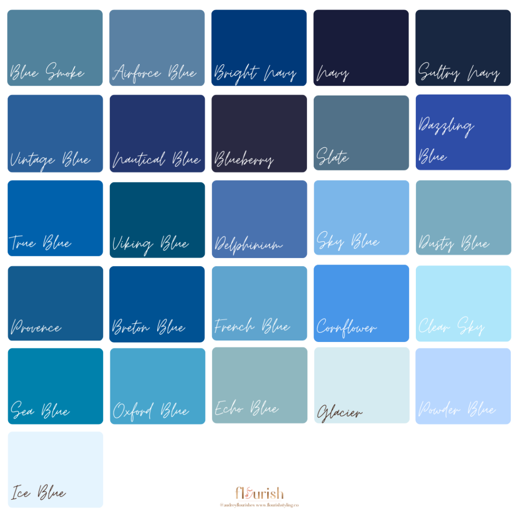
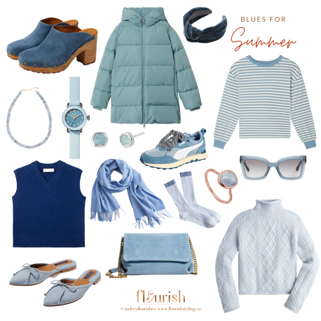
It’s not surprising that Summer has the most blues in its color palette, given that blue is naturally cool. The range extends all the way from navy to ice blue, encompassing shades that are both muted and soft. There are a few blues that can be found in the palettes for Autumn and Spring that are also found here, and this generally indicates that these colors are moderately muted or bright, with a more neutral undertone. But what really makes Summer blues unique is how dusty they can be. There is even a color in this palette called dusty blue! With varying amounts of grey undertones, the blues for this season are simply *chefs kiss*.
Crisp and icy Winter blues
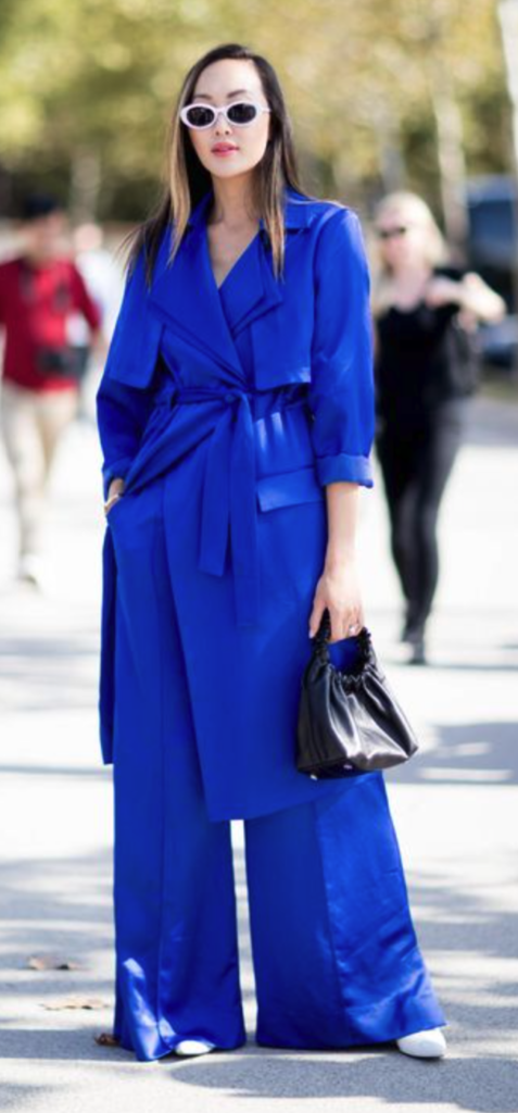
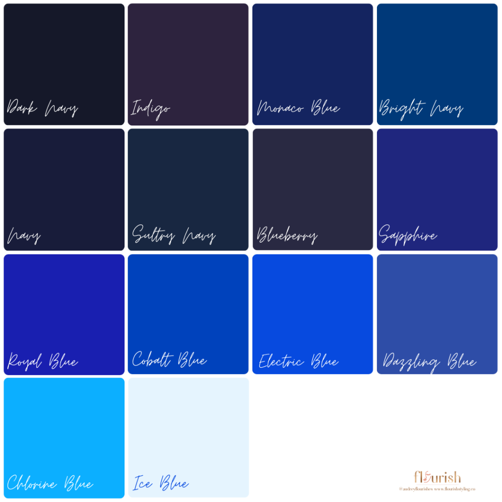
The best blues for Winters are exactly as you would think for this season that contains dark, saturated colors that are bright and luminous. How is it that a color can be both dark and bright, you might wonder. Well, just take a look at sapphire and royal blue. Both of these colors have an inexplicable depth to them, as if you could just fall right in. At the same time, they have a bright quality that excites the eye! Another way to describe these colors is intense. But on a Winter, they won’t look intense at all – they will instead bring clarity and harmony to her overall appearance. The darker shades like dark navy and sultry navy will really resonate with a Deep Winter, while the brighter shades of chlorine blue and electric blue are stunning on a Cool or True Winter.

Understanding the four main seasons
If you’ve been keeping up with each post in this series, you’ll have a pretty good idea by now of the qualities of each season, and how that affects their palettes. If you are new here, welcome! We would encourage you to go back and review these posts so you have a great foundation for our color exploration.
We are now offering Virtual Color Analysis!
If you don’t know your season & sub-season yet, never fear! There is a really great service we offer called Color Analysis, where we drape you in all sorts of fabulous color drapes to determine what your best colors are. If you’re not located near Pittsburgh, however, we are now offering Virtual Color Analysis, which entails taking a series of photos of your glorious face, and analyzing the tones in your hair, skin, eyes, and lips, to determine the details of your coloring.
While we are super excited to offer this service, it is worth saying that nothing compares to having your colors done in person, but we feel strongly that services like this should be more accessible! If you’re curious to know more about this service, feel free to reach out to us and we would be happy to provide you with all the information.
