Let’s get neutral, baby
This post contains affiliate links. If you use these links to buy something, we may earn a commission. Thanks!
When it comes to style, neutral colors sometimes get a bad rap. Not that there is anything “bad” about neutrals, they just have a reputation of being, well, boring. The word neutral literally designates the lack of a strong opinion or characteristic. So, when we think about dressing in neutral colors, it is generally to make sure we are not making a statement of any kind. Images of board room meetings, blank canvases, and bread crust comes to mind. Not a great first impression.
Re-frame your brain
However, we are here to reframe the way we think about neutrals. Especially in the context of your specific season. If you are familiar with the four different seasons in color analysis, you know that they are either warm or cool and clear or muted. (If you need some visual clues, check out our Pinterest page – we have a board for each season with plenty of examples to look at.) As with any other color in your palette, wearing the correct neutral colors has a way of giving you magical powers. Your skin looks clearer, your eyes and lips look brighter, and you present an overall harmonious vibe.
The evidence
That being said, neutrals from outside of your seasonal palette can make you look straight up ill. Let’s look at some examples, shall we? Below we have both Audrey and Shelly, sans makeup.
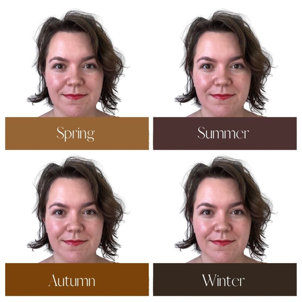

Audrey is a Deep Autumn and looks quite harmonious with the warm Autumn brown and gray. Because her sub-season, Deep Autumn, lives so close to Deep Winter, she could get away with wearing the Winter brown and gray if she wanted to.
Even though Spring colors are warm like Autumn and the two seasons do share some colors, the overall brightness of most of the colors overwhelms Audrey. Summer is the absolute worst, as the cool, light colors are completely opposite to her warm, deep coloring. She looks washed out and bland. Who wants that?!
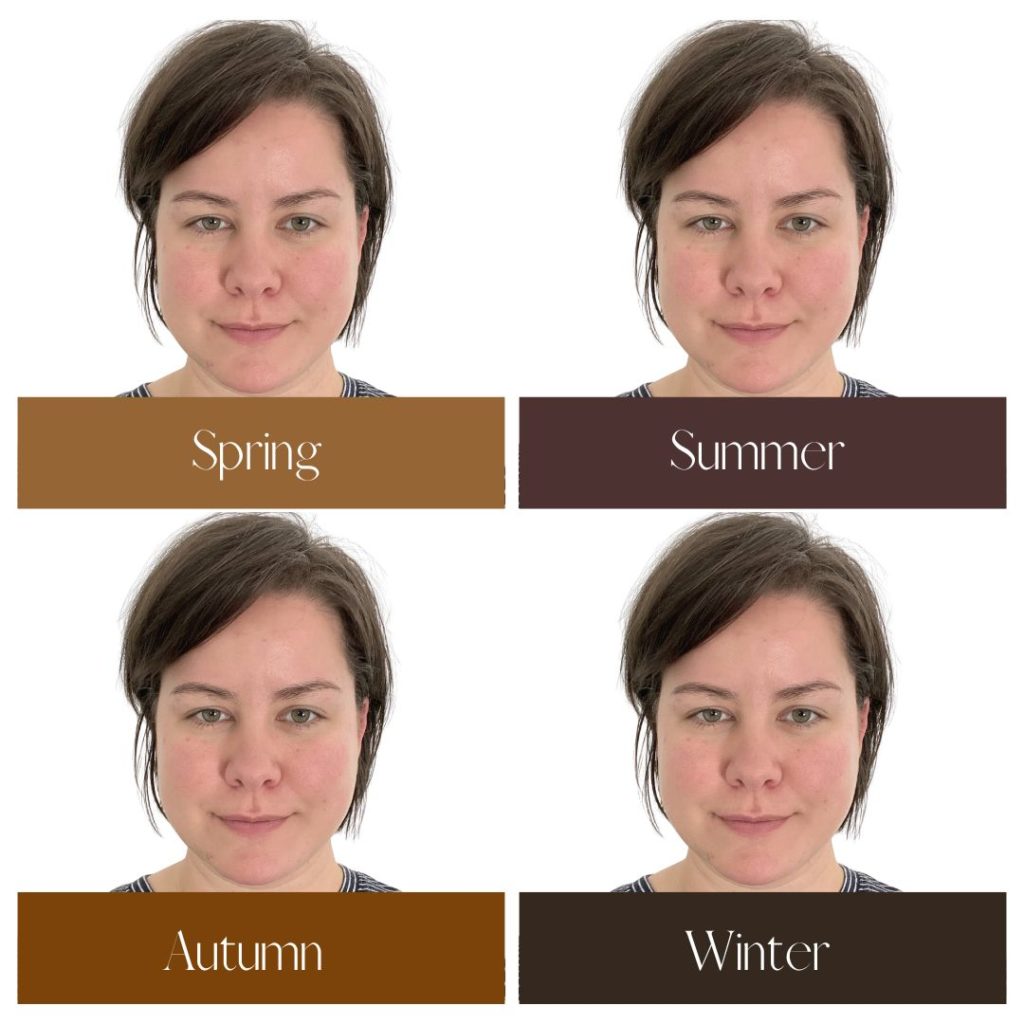

Shelly is a Deep Winter and looks fantastic in the cool, bright brown and gray of that season. When you look at those colors next to her face, you see her face first, rather than the color. A little trick, you see. The summer tones don’t look bad either, as the coolness of Shelly’s coloring seems to take precedence over anything else.
The Autumnal tones are so-so at best, with their warmth contributing to the yellowing of her skin. The Spring colors are by far the least ideal here, creating a certain harshness to the tone of her skin and drowning out the pinkness of her lips.
The right neutrals are the best foundation
The right neutrals provide an excellent foundation for incorporating beautiful accent colors into your outfit. The colors in your palette will generally always play nicely together, but it is worth noting that some will play better together than others. With neutrals, you don’t really have to worry about this because they will play with ALL of the other colors in your palette. If you work in an environment where “neutral” clothing is expected, you can embrace your seasonal neutrals while incorporating some of your more “fun” colors in small doses for an overall look that is NOT boring.
A note about navy
*Navy is and has always been considered an excellent “neutral” because it is a universal color. This means that no matter what your season is, you can wear navy. That being said, there are so many shades of navy it is mind-boggling, and there are certain navy colors that resonate the best with individual seasons. Therefore, we have included navy in our analysis.

Spring: warm, splashy, bright
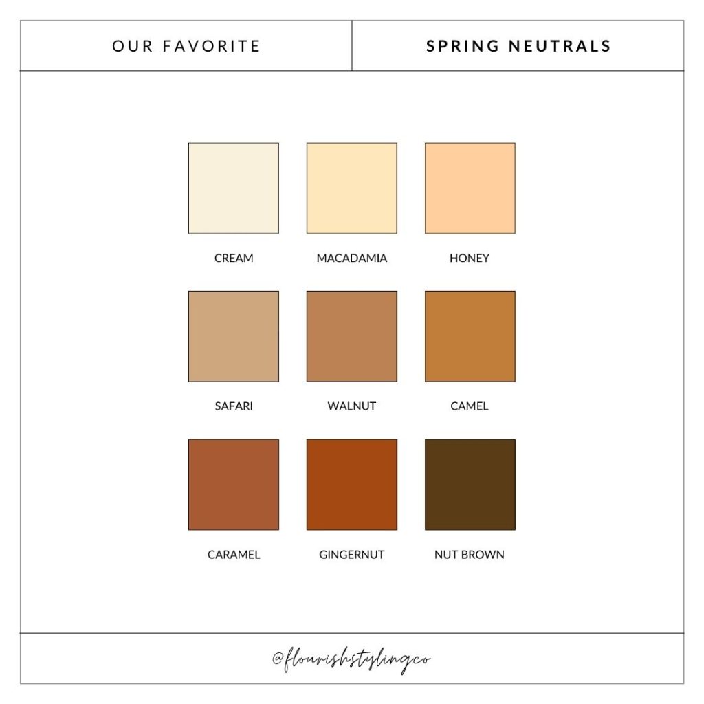
The Spring palette is light, clear, and warm. Therefore, the neutrals that fall into this palette don’t really have any darkness to them. You will not find black (a Winter-only color), dark blues, or dark grays. Instead, those with this season get neutrals that are bright and have a sort of airy quality to them. There is some minor crossover with some Autumn neutrals, such as camel and gingernut, as they are both warm palettes.
Springs generally shine in lighter colors like cream and honey. The navy that resonates best with this season is bright navy, as it does not bring the lightness of this palette down whatsoever.
Shop our neutral Spring obsessions!

Summer: cool, light, ethereal
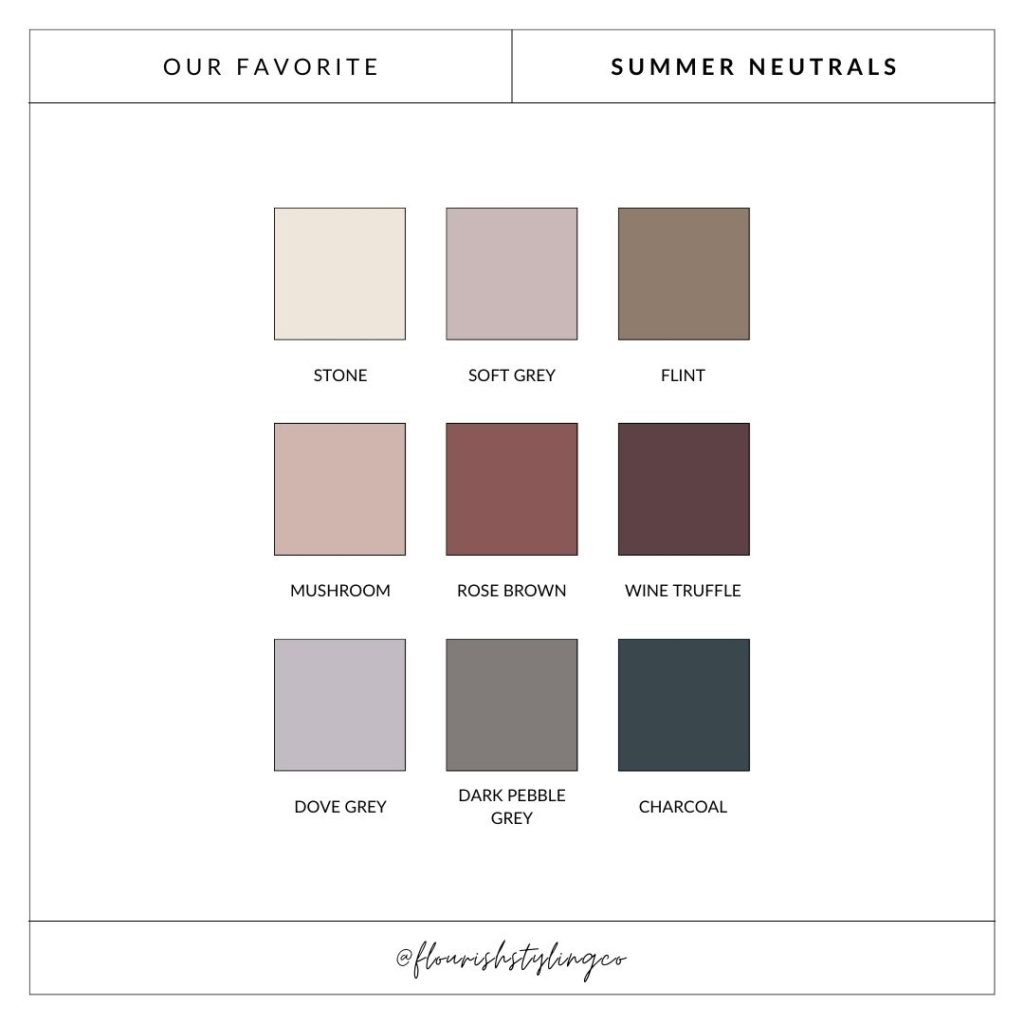
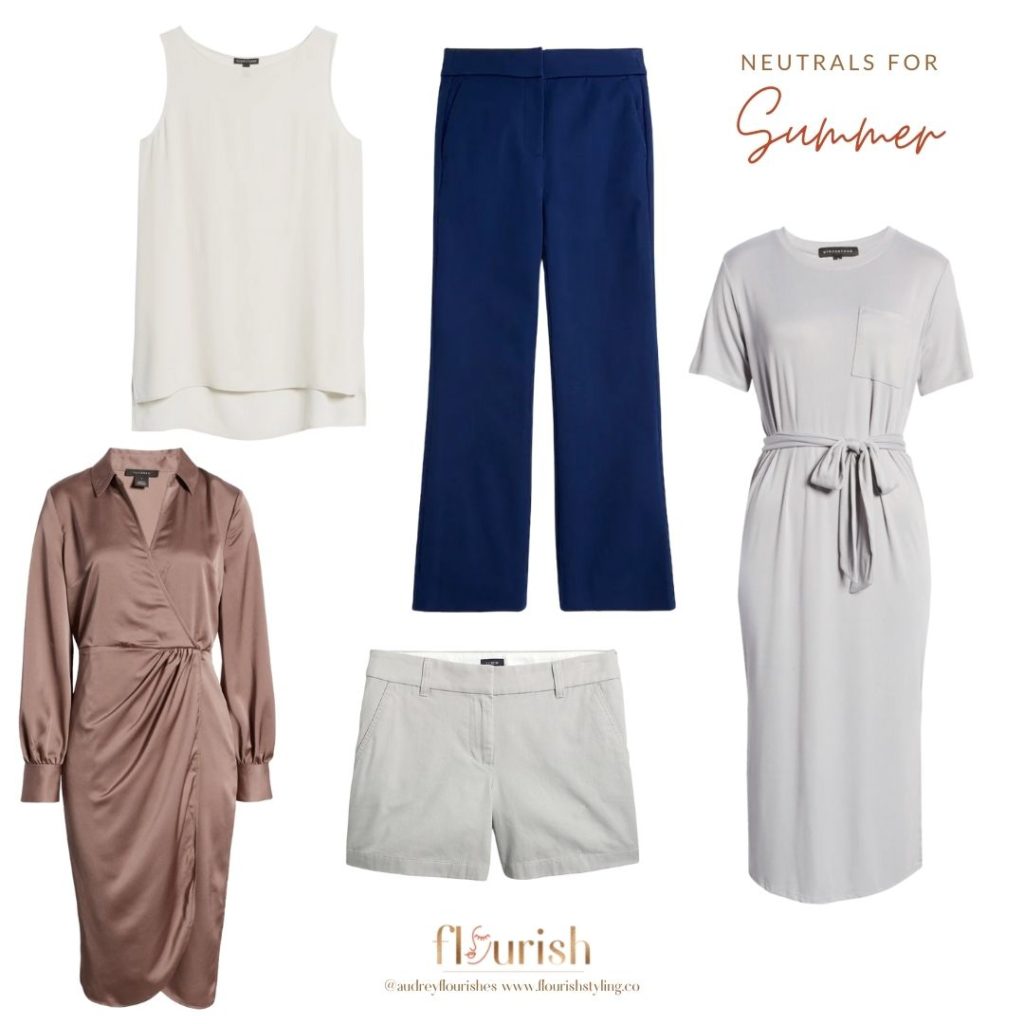
The Summer palette is soft, cool, and ranges from very light to moderately dark. Generally, these colors look as though they have had their volume turned down and speak at a whisper. But, that does not make them any less powerful. Summers should opt for soft white rather than Wintery true white, as the latter would look too severe. Light to dark grays are an excellent neutral as long as it has those cool, blue undertones.
The Summer palette does contain a few brown shades like taupe and rose brown, but again, they have cool tones and an extremely soft look to them.
Shop our neutral Summer obsessions!
Autumn: warm, earthy, vibrant
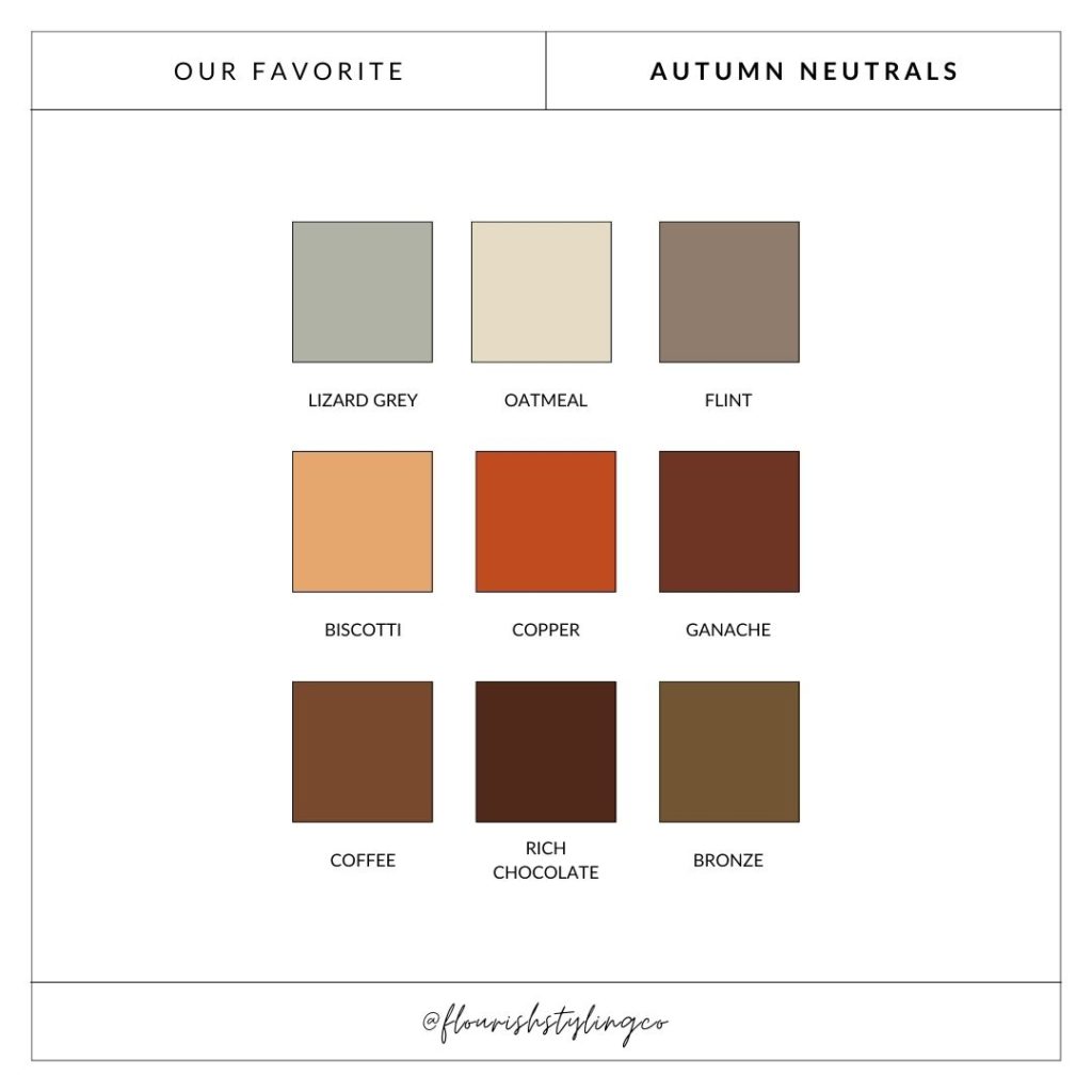
The Autumn palette is muted, deep, and warm. As with the Spring palette, all of the colors have a yellow undertone. But here, there is a deep quality, differing from the brightness of the Spring colors. Autumn neutrals encompass all of those rich browns that leaves take on as the temperature cools down, like copper, ganache, and rich chocolate.
Marine navy really vibes with this palette as it has a particular depth to it, like deep ocean water. Lizard gray is essentially the only gray that resonates with this season, as grays tend to have cooler qualities to them naturally. Adding in those yellow tones transforms it into an appropriate neutral for Autumns.
Shop our neutral Autumn obsessions!

Winter: cool, brilliant, intense
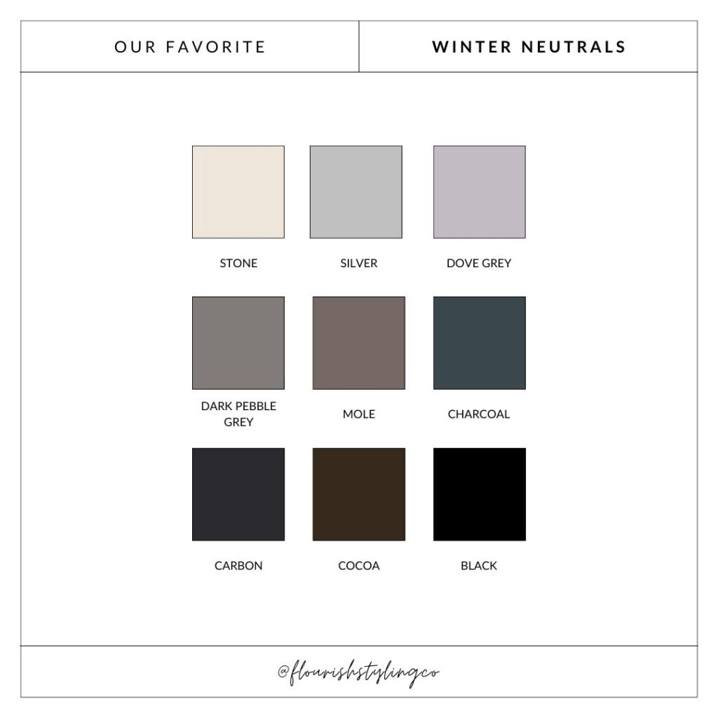
The Winter palette is clear, cool, and extreme. It ranges from light and bright colors to the darkest tones of gray and black. Unlike the whispery quality of Summer, Winter colors often come off as a little intimidating. But on a Winter, they have balance and cohesion.
Grey tones from medium to dark are an excellent way to go here, as long as they are not too muted, as with Summer grays. Surprisingly, cocoa brown is a fantastic neutral for this season, as it has the coolest undertone of any brown.
Mole is more unique neutral, and honestly not seen as much in real life. But if you can find it, go for it! It is one of my personal favorites. It is a perfect balance between these Winter grays and dark browns. And as far as navy goes, opt for a deep navy that embodies the cool, deep tones of arctic winter waters.
Sidebar
Winter is the ONLY season that has black in its palette. We know that black tends to be a default choice for neutral among all seasons, but does not complement any other season the way it does with Winter. We aren’t saying you have to break up with black if you aren’t a Winter, but we would strongly encourage you to opt for your best navy or other dark neutral instead.
Shop our neutral Winter obsessions!

Discover and embrace your season
As you can see, each season has its own unique spin on neutral colors, and it really does make a huge difference when you wear the neutrals that love you back. With the right neutrals, you look cohesive, in harmony, and alive (literally)! If you don’t know what your season is and are brimming with curiosity, reach out to us! Even if you are not located in Pittsburgh or Austin, we got you. We now offer Virtual Color AnalysisWe can start the process of uncovering the color palette that jives with your vibe, but we can also go on to talk about style archetypes and hone in on what makes you, YOU.
